01
The idea
Field Heritage. Seventy years of retriever tradition, run by people who compete. The brand has to read as serious working dogs without turning cold or technical — the audience is hunters and field-trial handlers, not software buyers. Warm, unglamorous, confident. Gold and bronze because that is what the original identity was built on; black silhouette art because that is the logo the business already owns.
Asset one
The silhouette mark
A retriever, cattails, an arrow, and three ducks in flight. Pure black on white. Tells the whole story: steadiness, marsh cover, direction, and birds working the decoys. One-colour, so it survives embroidery, decals, and a favicon.
Asset two
The serif wordmark
“REACTION” in italic serif over “RETRIEVERS, LLC” in bold upright serif. This is the voice of the brand — traditional, considered, a little old-fashioned in the best way.
Asset three
The athletic wordmark
The hero banner sets “REACTION RETRIEVERS” in a heavy oblique grotesque with squared terminals. This is the brand's other half: speed, drive, competition.
The type system comes from those last two assets. The site pairs a serif for authority with a condensed grotesque for athletic energy, because the brand already uses both. That is not a designer's whim layered on top — it is the identity, systematised.
02
Logo
Three files, all recovered from the original site. Never redraw, recolour, or re-typeset any of them — they are the brand.

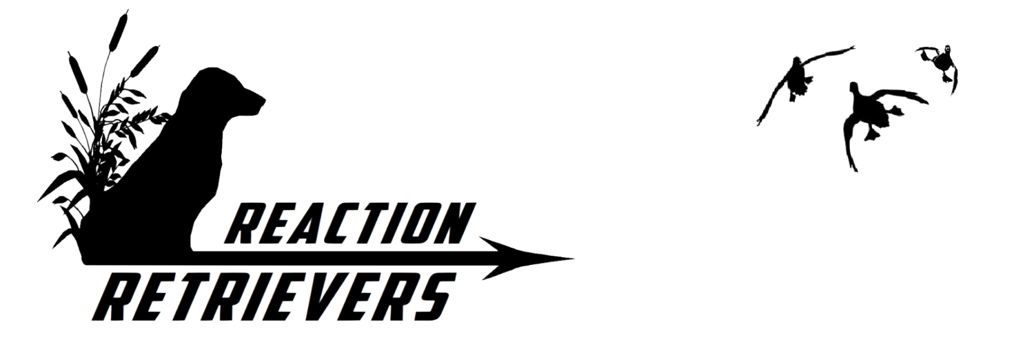

| File | Use | Minimum size |
|---|---|---|
cropped-logo750x200llc.png |
Site header, invoices, letterhead. Max 300px wide in the header. | 180px wide |
1500x500-logo-slide2-1.png |
Hero banner, social cover, email header. Needs width to read. | 600px wide |
logo-500x500tr.png |
Circular badge contexts: social avatars, decals, embroidery. | 96px wide |
Do
- Keep clear space of at least the height of the wordmark's cap on all sides.
- Use on white, paper, parchment or sand — the warm light surfaces.
- Scale proportionally from the supplied PNGs.
- For dark surfaces, supply a reversed (knockout) version rather than filtering the original.
Don't
- Don't recolour the silhouette mark, or add a gradient or drop shadow to it.
- Don't put the serif wordmark on a busy photo — it needs a clean surface.
- Don't stretch, skew, or re-track the lettering.
- Don't set the wordmark in a different typeface — if you need live text, use the display stack below, but it will never be the logo.
03
Colour
Four families. Every neutral is warm — red channel at or above green,
green at or above blue. There are no cool greys anywhere in this brand, and that single
rule does more for the feel of the site than any other decision here. Contrast ratios
below are asserted by check_brand.py against WCAG AA; the number shown is
measured against the paper background unless noted.
| Token | Hex | Role |
|---|---|---|
--gold-900 | #402306 | Deepest text on light surfaces |
--gold-800 | #5E3409 | Nav links, table headers, labels |
--gold-700 | #7C440C | Link colour, eyebrows — 5.37:1 |
--gold-600 | #99540F | Primary buttons, focus ring — 5.46:1 as text |
--gold-500 | #AA7C19 | Rules, hover, accent lines |
--gold-400 | #C48E4C | Header wash tint, borders |
--gold-300 | #D2B77E | Links on dark — 9.46:1 on ink-deep |
--gold-200 | #E2CEA1 | Hero wash, the original “cream” |
--gold-100 | #F7F1E1 | Hover fills, notes, panel backgrounds |
--accent | #E8C12F | Bright highlight, on dark only — 10.59:1 on ink-deep |
gold-900
#402306
gold-800
#5E3409
gold-700
#7C440C
5.37:1
gold-600
#99540F
5.46:1
gold-500
#AA7C19
gold-400
#C48E4C
gold-300
#D2B77E
gold-200
#E2CEA1
gold-100
#F7F1E1
accent
#E8C12F
| Token | Hex | Role |
|---|---|---|
--ink | #1C1812 | Headings, strong text — 16.67:1 |
--ink-2 | #4E463A | Body copy — 8.76:1 |
--ink-3 | #7B7163 | Captions, metadata — 4.52:1 |
--ink-4 | #A79B88 | Disabled, decorative only — never body text |
| Token | Hex | Role |
|---|---|---|
--white | #FFFFFF | Page body, panels |
--paper | #FBF8F2 | Default page background |
--parchment | #F4EFE3 | Alternating section background |
--sand | #E8E1D0 | Third-level section background |
--line | #E2DCCC | All borders and rules |
--ink-deep | #17140E | The dark chapter: footer, closing sections |
--ink-deep-2 | #26211A | Borders and dividers inside the dark chapter |
--on-dark | #EFE9DC | Headings on dark — 15.19:1 |
--on-dark-2 | #B9AF9C | Body on dark — 8.47:1 |
ink
#1C1812
ink-2
#4E463A
ink-3
#7B7163
ink-4
#A79B88
paper
#FBF8F2
parchment
#F4EFE3
sand
#E8E1D0
line
#E2DCCC
ink-deep
#17140E
on-dark
#EFE9DC
| Token | Hex | Role |
|---|---|---|
--success | #4F6136 | Confirmation ticks only — 6.40:1. Replaces the cold teal (#009678) the old theme used, which fought the gold. |
--danger | #8E2F26 | Warnings and error emphasis |
success
#4F6136
6.40:1
danger
#8E2F26
04
Typography
Three roles, three families, eight weights total. Each family has one job and is not
used outside it. All three are SIL Open Font License and self-hosted —
the site's Content-Security-Policy is font-src 'self', so a Google Fonts
link would simply be blocked.
Display — Source Serif 4
Aa Bb Cc 0123
Headings, page titles, phone numbers, photo captions (italic). Weight 400–600. Never above 600 — heavy bold on a serif reads cheap, and the medium weight is what gives the brand its considered tone.
Accent — Oswald
Aa Bb Cc 0123
Navigation, buttons, eyebrows, table headers, footer headings. Always uppercase, always tracked. This is the athletic layer and it echoes the heavy oblique grotesque in the hero banner. Never for running text.
Text — Source Sans 3
Aa Bb Cc 0123
Body copy, lists, links in prose, small print. Weight 400–600. Shares a superfamily with Source Serif 4, so the two are metrically harmonious by design rather than by luck.
Specimen
Our program is based on fair and humane techniques, utilizing attrition and teaching thoroughly, all while maintaining very high standards. This fine balance is key to the success of any dog.
A seven-month in-house program, running January to August.
photo by Mark Atwater
| Token | Size | Line height | Tracking | Family & weight |
|---|---|---|---|---|
--fs-display | 34–56px | 1.05 | -0.02em | Serif 600 |
--fs-h1 | 28–44px | 1.12 | -0.01em | Serif 600 |
--fs-h2 | 23–32px | 1.20 | -0.01em | Serif 600 |
--fs-h3 | 20–24px | 1.35 | -0.01em | Serif 600 |
--fs-h4 | 20px | 1.35 | -0.01em | Serif 600 |
--fs-lead | 20px | 1.55 | 0 | Serif 400 |
--fs-body | 17px | 1.65 | 0 | Sans 400 |
--fs-sm | 15px | 1.60 | 0 | Sans 400 |
--fs-caption | 13.5px | 1.50 | 0 | Serif italic 400 |
--fs-eyebrow | 12.5px | 1.40 | 0.18em | Oswald 600 |
--fs-micro | 12px | 1.40 | 0.14em | Oswald 500 |
Why the type changed at all. The previous build used Adamina for
everything. Adamina ships only weight 400 — so every bold on the site was
synthesised by the browser, and there was no way to build a hierarchy. The inherited
tag sizes were also broken: h5 was smaller than h6, and
h2 sat 2px above h3. A single-weight family with an inverted
scale is why the old site read flat. This system fixes both.
05
Space, shape, depth
Spacing is a 4px grid. Radii are restrained — this is a traditional brand, not a SaaS product. Depth comes from layered, very low-opacity warm shadows rather than single hard drop shadows.
| Token | Value | Used for |
|---|---|---|
--s-1 – --s-4 | 4 / 8 / 12 / 16px | Inside components: padding, gaps between related items |
--s-5 – --s-6 | 24 / 32px | Between components, card padding, grid gaps |
--s-7 – --s-9 | 48 / 72 / 96px | Section padding. Generous — whitespace is the brand's luxury |
| Token | Value | Used for |
|---|---|---|
--r-xs | 3px | Buttons, small labels — keeps the athletic layer crisp |
--r-sm | 5px | Menu items, inline elements |
--r-md | 8px | Cards and panels |
--r-lg | 14px | Featured containers |
--shadow-1 | soft | Cards at rest |
--shadow-2 | medium | Hero band, scroll-to-top |
--shadow-3 | deep | Open navigation panel only |
06
Components
The repeating pattern is always the same: an Oswald eyebrow in gold, a serif heading, then body copy with a maximum measure of 68 characters. Every page on the site uses it.
Section header pattern, light
Training Programs
Finished Gun Dogs
Dogs in the Finished Gun Dog Program learn to proficiently mark birds and to perform blind retrieves on land and water.
The dark chapter — footer and closing sections
On dark
Ready to start?
Call (306) 327-7729 to book an appointment and view the training grounds.
Note
Callout
Gold left rule, gold-100 fill, no shadow. Used for anything the reader must not miss.
Eyebrow + title
Page masthead
Every interior page opens with its parent section as the eyebrow, its own name as the serif title, and a short gold rule underneath.
Colour contrast is a build gate, not a preference. Run
python check_brand.py after touching any colour. It measures all 25
text/background pairings the stylesheet actually renders, asserts the gold ramp darkens
monotonically, and asserts every neutral is genuinely warm. A palette tweak that breaks
readability fails the check.
07
Voice
Plain, confident, unhurried. The reader is an experienced handler; do not explain retrievers to them.
Write like this
- “Dogs trained at Reaction Retrievers get noticed.”
- “A seven-month in-house program, running January to August.”
- “Steady to wing and shot.”
- Specific numbers over adjectives.
- Short sentences. Let them land.
Not like this
- “Unleash your dog's full potential today!”
- “State-of-the-art training solutions.”
- “We're passionate about dogs.” (Everyone is. Show it instead.)
- Exclamation marks.
- Claims we cannot source — rates, titles, program lengths.
08
Applying it
One CSS file holds the whole system. Nothing on the site should carry a hard-coded hex
value or a raw font-family stack.
| File | Contains |
|---|---|
assets/css/style.css | Tokens, type scale, and every component on the public site. The single source of truth. |
assets/fonts/*.woff2 | The three families. Variable fonts, so one file per family. |
brand/index.html | This guide. Not deployed. |
check_brand.py | The contrast and ramp assertions. |
audit.py | Link, CSP and .htaccess checks. Also fails the build on any inline style= or event handler, which is what keeps the strict CSP working. |
Before changing a colour: edit the token in style.css,
mirror it in check_brand.py, run the check, then run python build.py.
That order is the whole discipline — it is what stops a palette drift from quietly
dropping text below readable contrast.